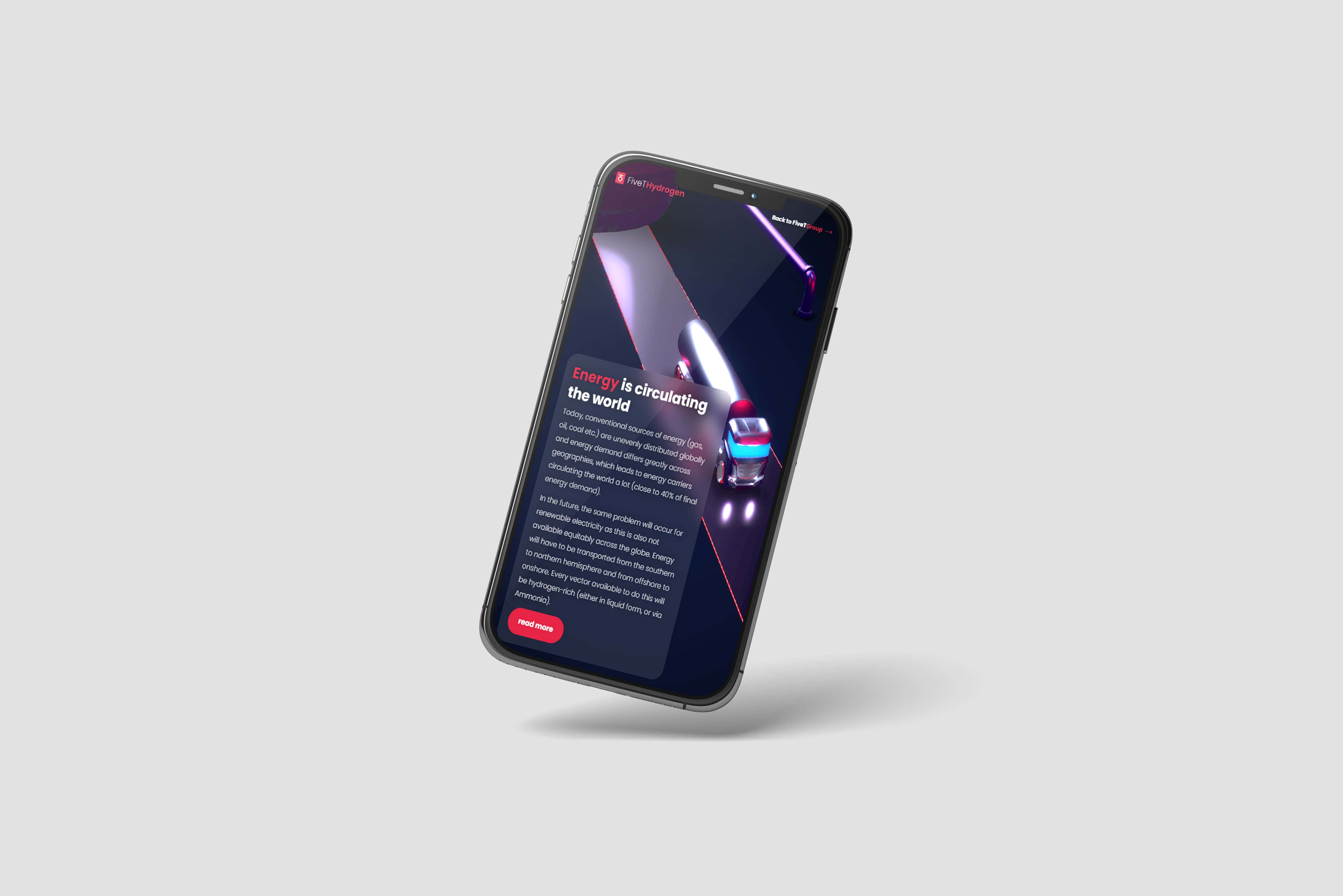
Branding

FiveT Group

View web experience

Brand identity from scratch

FiveT was on the verge of launching a radical new infrastructure: the world’s first green, hydrogen only infrastructure fund. This called for a similarly radical reinvention of its brand identity – ensuring that, like its infrastructure, remains ahead of the curve. In collaboration with the FiveT team we created a new brand identity from scratch: from logo and colours, to an interactive website.

Interactive experience

To best tell the story of FiveT’s mission, we designed the website as an animated, interactive experience. Visitors follow the route of hydrogen: from production, to distribution, ending at application. Every step in this supply chain is visualised with colorful animations, and smaller deep dives that introduce bits and pieces of information.

This interactive design turns visiting the website into a personal approach. It enables users to go through the different elements at their own pace - delving into the details when they feel like it, and/or scrolling through the parts they might already know.

Looking for a (re-)branding of your company?

Leave your details, and receive a concept.

Responsive experience

The interactive experience is responsive for all devices. No matter if you're visiting the experience on a laptop, tablet or mobile phone: its intuitive navigation works for all.

This mock-up image shows the interactive website design with three.JS for FiveT Hydrogen focussing on how energy is circulating the worldThis mock-up image shows the interactive website design on iPad with three.JS for FiveT Hydrogen focussing on how energy is circulating the worldThis mock-up image shows the interactive website design on mobile phone with three.JS for FiveT Hydrogen focussing on how energy is circulating the world
This image shows the logo icon for FiveT

Logo

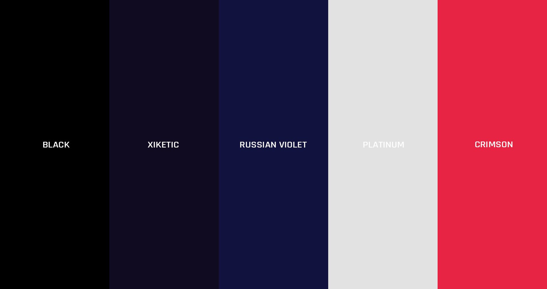
A striking graphic symbol has been introduced – one that reflects the company’s culture and style. It is a mix of an organic shape – the circle – and cubic shapes – the ‘T-lines’ that spring from the circle. In part, these shapes are inspired by the name of the company: both a ‘5’ and a ‘T’ can be traced. The symbol is framed in an elegant, crimson-coloured rectangle.

Colours

The identity introduces a fresh and contemporary colour palette that goes beyond the usual light blue and green ubiquitous in branding for sustainability and a healthy future. We have selected black, crimson and russian violet as the main colours. The crimson and russian violet are inspired by feelings we associate with hydrogen - and the energy it can provide. Black adds a timeless character to the complementary set of modern colours.

This image shows the colour palette for branding of FiveT

Find out what we can do for you!

Contact us at info@sensu.org or call +31 20 777 20 72.

Contact
Please rotate your screen
close
Cookies

We use cookies to improve your browsing experience on our website, to analyze our website traffic, and to understand where our visitors are coming from.

accept cookies no, i don't accept